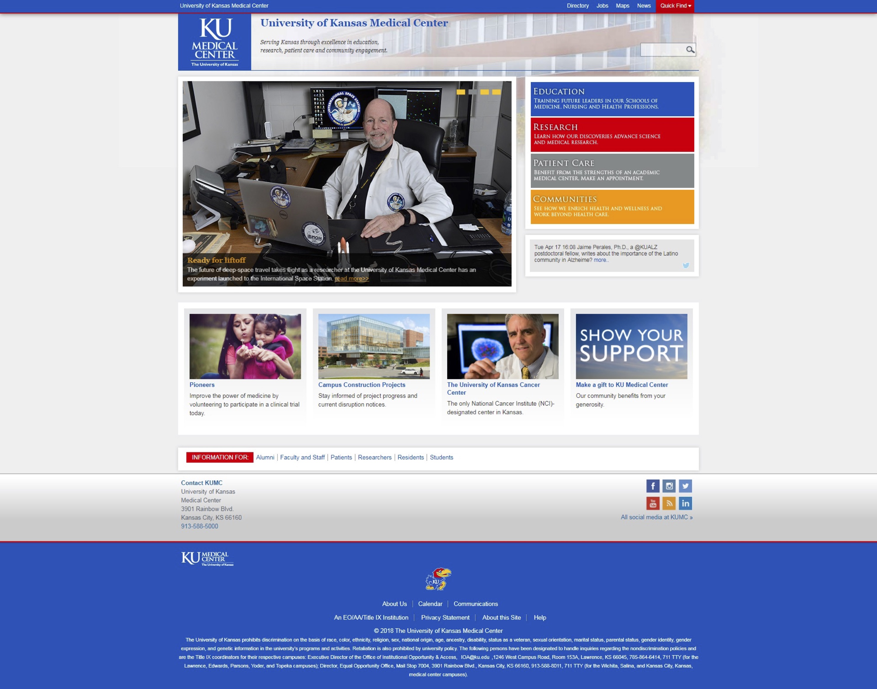
At the beginning of the KU Medical Center web redesign project, the website focused on news, lacked a defined audience and didn’t offer clear paths to information. There were no site menus to navigate to specific pages, which required users to navigate several pages to find information.
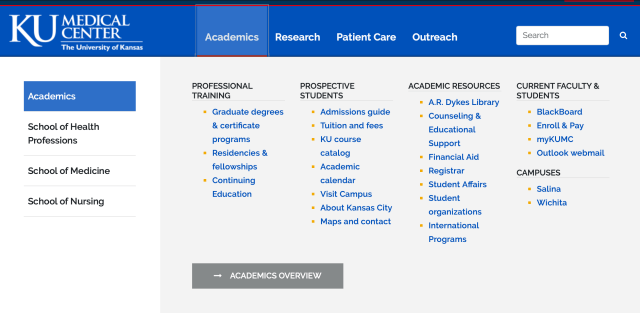
The next phase of the project was the refreshed website. The current medical center website is still shown in this phase. It includes redesigned main pages that focus on information potential students would seek. The majority of the website has not been rewritten, so many deeper level pages still have a strong news focus and do not target potential students.

One major improvement on the refreshed site are mega menus that allow users to quickly navigate to needed information.
The final stage, and the step the web team is currently working on, is the upcoming, redesigned website. It will be entirely rewritten with a specific focus on potential students. The content will be concise and easy to navigate. Photos will be a prominent feature on most pages.
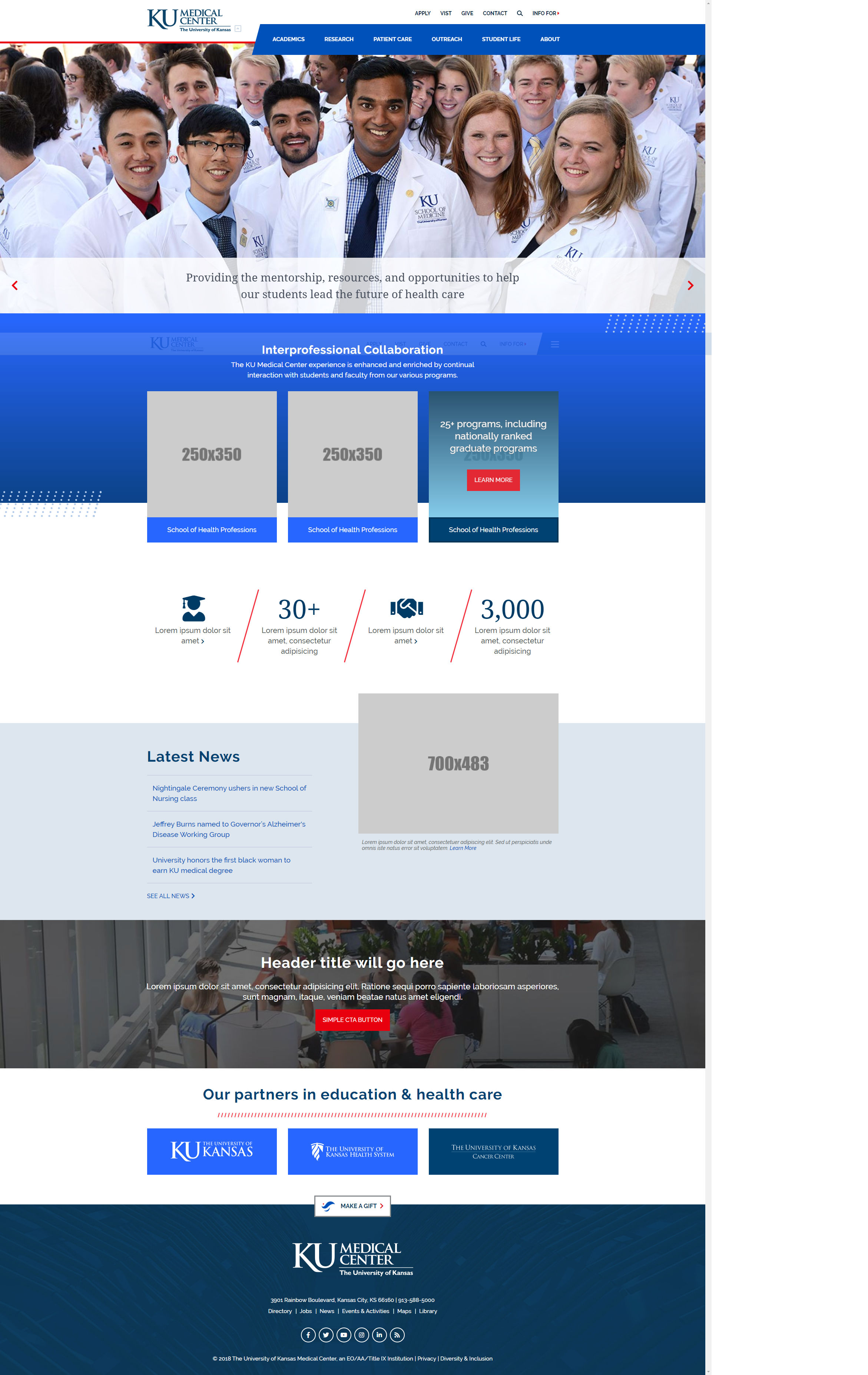
As you can see in the menu below, many pages will be condensed to provide information quickly and without clicking through several pages.

As a member of the web team, my role was to strategically rewrite web copy and improve the user experience. This involved a lot of research and consideration on how visitors use the website, as well as determining what marketing messages we wanted to convey to our target audiences.
